
In the January issue of Journal of Paramedic Practice, I discussed how the nearness to death effect meant that around 50% of a person's lifetime hospital inpatient demand was compressed into their last year of life (Jones, 2019). Planning in the NHS currently relies on the erroneous assumption that demand is entirely a result of age and deprivation. A recent study has demonstrated however that omission of the absolute number of deaths from the NHS funding formula leads to the incorrect allocation of funds (Jones and Kellett, 2018).
Variance in deaths and pressure
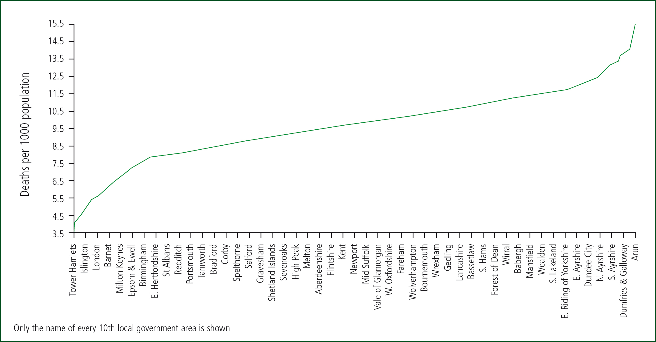
Clearly, some areas have more deaths than others, and Figure 1 shows the distribution of deaths per 1000 population across local government areas in the UK. Data are for 2017 and are from the Office for National Statistics (ONS) (2018a). The fewest deaths per 1000 population occur in London with the 14 lowest local authorities in the UK. Slough (5.3 deaths per 1000 population) comes in at number 15. At the other end, the top five local authorities (East Lindsey, Christchurch, Inverclyde, Rother, Tendring) all have more than 14 deaths per 1000 population. Of the four countries of the UK, Northern Ireland has the youngest population with only 8.6 deaths per 1000 population compared with 10.7 in Scotland. This inherent 5-times difference in deaths per 1000 population (as per Figure 1) therefore places markedly different end-of-life pressures on NHS organisations.
The last year of life is characterised by functional and cognitive decline and increasing dependence on carers for the activities of daily life (Rabbit et al, 2008; Kalbarczyk-Steclik and Nicinska, 2015; Aaltonen et al, 2017). Symptoms of anorexia, dyspnoea, fatigue and pain all increase (Singer et al, 2015); hence increasing numbers of falls and accidents resulting in fractures and other injuries along with indicators of failing immune function such as respiratory and other infections (Jones and Goldeck, 2014). Any forecast of future demand therefore must take trends in deaths into account along with the usual effects of age alone (Moore et al, 2017).
Age and end-of-life demand
One of the key observations regarding the nearness to death effect is that the demand is largely insensitive to the age at death (Busse et al, 2002). Hence, while it is widely known that people in more deprived areas die younger, it is nearness to death that counts. Calculated measures of deprivation are used to allocate more money to deprived areas; however, death auto-adjusts for less precise estimates based on deprivation. Deprivation is itself a poor measure since hospital admission depends far more on social group and associated health behaviours than deprivation per se (Beeknoo and Jones, 2016a; 2016b).
Trends in death are location-specific
Owing to the different demographic features of each location including inward and outward migration, growth in number of deaths in recent years shows markedly different trends. Figure 2 therefore shows the maximum vs minimum difference in number of deaths for local government areas in England and Wales since 2001. Data are from the ONS (2018b). The North East of England shows the least change in number of deaths. Note that, as a general rule, the total number of deaths in the UK reached a minimum around 2011 (Jones, 2017). Increased numbers of deaths since then has contributed to rising inpatient demand (Jones 2018a; 2018b). The magnitude of the increase in deaths since 2011 has been totally unexpected (Jones, 2017); however, deaths will now continue to rise for the next 30 or more years (ONS, 2018c).
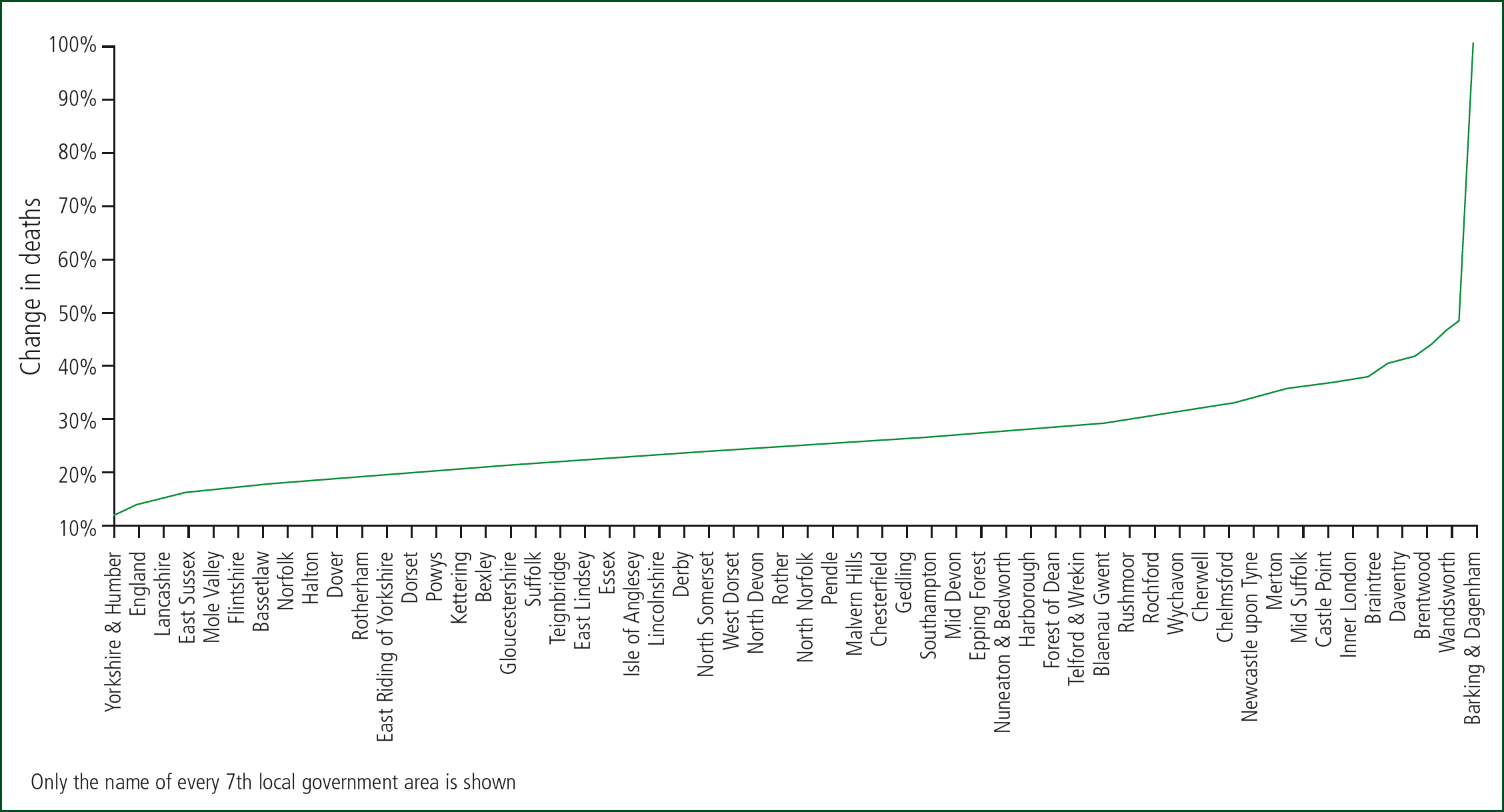
At local level, the point of minimum deaths varies considerably from the 12 months ending September 2006 in Milton Keynes; February 2010 in Worcestershire; December 2010 in County Durham; January 2012 in Torbay; December 2012 in Southend-on-Sea; April 2014 in Croydon, etc. These unrecognised trends are making subtle and sometimes not-so-subtle changes in the end-of-life and, therefore, total elements of demand.
Conclusions
Forecasting demand based on age alone gives highly misleading estimates (Moore et al, 2017) and can generate needless friction between purchasers and providers regarding the mismatch between forecasts and reality. The last year of life represents very high demand. Deaths have generally risen since 2011; however, local trends give markedly different demand scenarios. In the absence of the recognition of the nearness to death effect, the NHS funding formula is likely to be seriously flawed. Why organisations such as NHS England are not disseminating awareness to these facts remains a mystery—ignorance is not bliss!