
Since no one at the top, from NHS England to our politicians, appears to want to speak the truth, shall we have a chat as to why NHS capacity pressures keep on escalating?
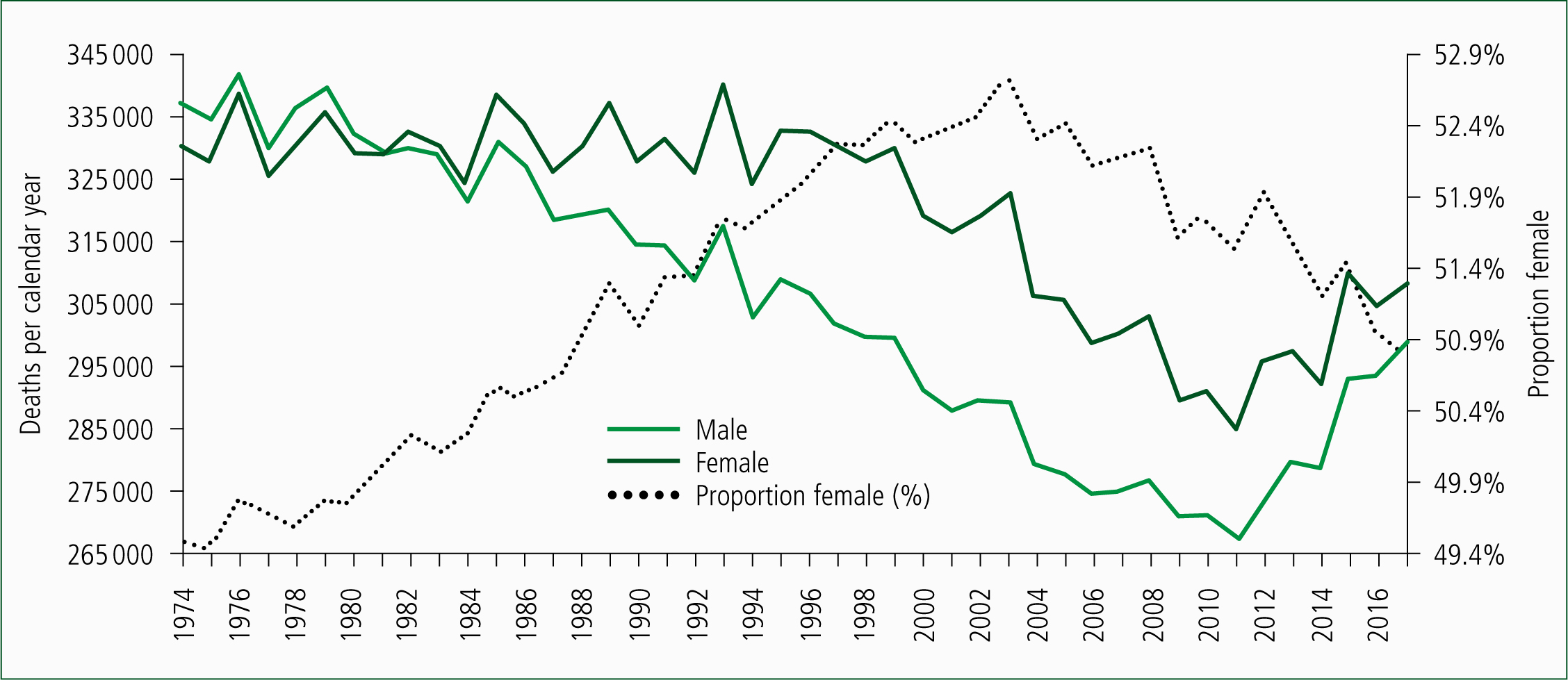
Figure 1 shows the trend in deaths for males and females in the UK from 1974 to 2017 (Office for National Statistics (ONS), 2018a). Total deaths in males steadily declined from 1974 onward and in females from 1994 onward. The alarming rise since 2011 of nearly 9000 per annum caught actuaries completely by surprise (Jones, 2017a; 2017b).
Nearness to death effect
So, what have deaths to do with capacity pressures? There is a very simple answer: the nearness to death effect. The nearness to death effect has been documented for around four decades and shows that healthcare demand escalates with nearness to death and not with age, per se (Payne et al, 2007). Around half of a person's lifetime hospital inpatient admissions and bed occupancy is compressed into the last year of life (Hanlon et al, 1998). Hence, the marginal changes in deaths are intimately linked to the marginal changes in medical admissions (Jones, 2018a). If you ignore the nearness to death effect, you get the entirely false impression that it is all of those older people consuming the resources.
For those who have been in the ambulance service for many years, have a moment's reflection around how Figure 1 may have influenced the marginal changes in the proportions of male and female ambulance journeys, especially since 2003. I think you have probably gathered the point.
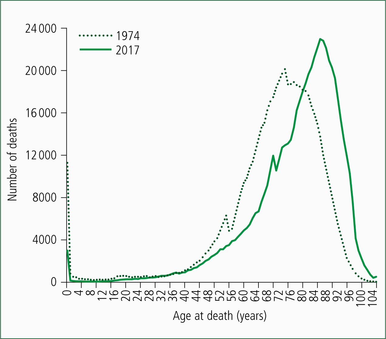
However, the issue regarding older people consuming all of the resources is addressed in Figure 2 where the age at death in 1974 is compared with that in 2017. Deaths in 1974 have been adjusted down to the same total as in 2017. As can be seen, in 1974, the bulk of deaths occurred below the age of 80; while in 2017, it is above age 80. The age of death has increased; hence, the nearness to death effect makes it seem that older people are clogging up the ambulances, etc. Nothing has changed. It has always been that the dying people (in their last year of life), irrespective of their age, drive the marginal pressures on NHS capacity.
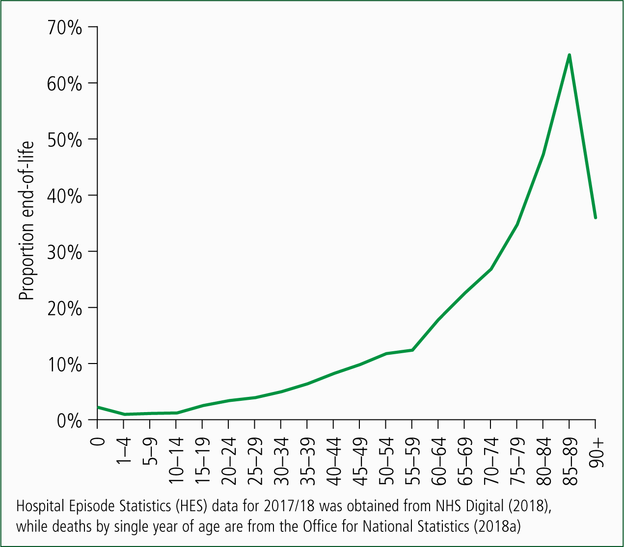
Clearly, non-end-of-life NHS demand pressures are also age-related and Figure 3 attempts to disentangle how many admissions in the medical group of specialties may be a result of each source. Figure 3 makes such an estimate by assuming that every person has seven admissions (emergency and elective, including day case) in the last year of life. As is demonstrated, the proportion of admissions which are end-of-life-related rises with age except in the oldest old (age 90+). It is likely that the number of admissions in the last year of life may vary with age (especially in the oldest old). However, the principle is that the total admissions, ambulance journeys etc, rise in proportion to the speed of change in the population age-structure, relative to the rate of change in deaths.
Regarding the rate of change in deaths, between 1991 and 2011, deaths in the UK were decreasing by around 4940 per annum. However, since 2011, they have been increasing by around 8840 per annum, and deaths have continued to increase throughout 2018 (Jones, 2018b). Hence, the end-of-life-based winter pressures in 2018/19 will indeed be worse than ever before—irrespective of whether or not there is an influenza outbreak! Influenza would only make a bad situation worse.
Why the increase in deaths?
Why the sudden increase in deaths since 2011? I can only point you to my research, which shows that whatever is happening has all the hallmarks of a unique type of disease outbreak (Jones, 2017a; 2017b; 2017c; 2017d; 2017e). The saw-tooth patterns in Figure 1, especially when associated with higher female deaths, provide a hint as to which years these outbreaks occur. Indeed, the possibility exists that they make an influenza outbreak appear worse than it may otherwise be (Jones, 2017b). This is a seemingly unpalatable answer (Jones, 2018c). I can only suggest that you conduct your own research.
Looking to the future
What may the future hold? Due to the World War II baby boom, and net inward immigration from 1948 onward, deaths will continue to escalate for many years to come (ONS, 2018b). The nearness-to-death-fuelled pressures will continue to escalate.
I would suggest modelling future demand using two compartment models based on age for the non-end-of-life component of demand and the number of deaths for the nearness-to-death part of demand (Moore et al, 2017). We need to be able to separate out the two parts of growth. Hopefully, higher integration (in years to come) may help stem the rising demand from the end-of-life-based component of total demand.
As they say, blue lights on and fasten your seat belts! This call-out may be fast and furious.